 Did You Know?
by Chip Brooks Article #20 |
|
Did You Know? by Chip Brooks Article #20 |
|
The intro to Article #20 was about the upcoming Sept. 2002 Long Beach Coin Show...so I won't bore you with the gory details. I have added several images to the On-Line version which will give you more examples of 'Versions'. When you see a green underlined word...click on it.
Did You Know?
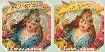
The more advanced you become as a Cigar Label Art collector, the more you find yourself branching out into the various aspects of the collectible. Collecting 'Versions' of an image is one of the more fun and interesting facets. Image 'Versions' may occur for several reasons...the company that originally made the image may have folded or have been sold to another litho company who used the same image for a different cigar line...a cigar maker may have bought a large surplus of an image and the cigar fell out of favor with the public so they sold the surplus to another cigar maker...an independent tobacco grower may have approached a cigar factory to use his tobacco but the box and a surplus label would be provided by the factory...etc. Each time the image was passed on to another factory or litho company, a different brand name was added to the untitled image.

In the example above, the untitled label was used to create 3 different versions. George Schlegel created this image of R. M. Hoe (the inventor of the Steam Lithographic Press) originally to be titled "La Flor de R. M. Hoe" (top right). The other 2 versions, Uncle Ed and Tom Ross, used the original pre-1900 untitled litho and just added their new brand name to the image. It is not known when the other 2 cigar brands came into existence.
 (Old Litho) There is another aspect of 'Versions' that is collectible as well. If the cigar brand successfully spanned over decades and the company felt the image needed to be updated, they would give the original image a face-lift. "Two Friends" is an excellent example of just that. The cigar was popular in the late 1800's and that success continued through the 1920's.
 (Newer Version-Photomechanical) In keeping with the times, the makers replaced the original Victorian look with a more modern 20's flapper look. In this newer version the lady has shorter hair, a shorter dress and a different necklace but the dog and the background setting are basically the same. There is another major difference between the two labels: the older version is a beautiful litho that is richly embossed and the newer version is a photomechanical, non-embossed image.
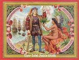
This next set of labels is really an interesting group. The original label "Sigarenfabrieken" as I call it (I don't know what its original title was), was created by the Heijnen & Co. cigar factory, Eindhoven (about 70 miles southeast of Amsterdam), Netherlands. This was a special cigar that was made for and sold only at the 1893 World's Columbian Exposition in Chicago. The text is in Dutch and the litho # is "V. 5011". In Dutch "Sigarenfabrieken" means Cigar Factories/Manufacturers. Eindhoven was the Mecca of cigar makers in the 1800's through the early 1900's. Today it is the home of Phillips Electronics...go figure. 
Another version of this label with several changes to the image is litho "No. 18238". The text is in English (with none of the Dutch references), the maiden is semi-nude, Chris Columbus is better looking, the flag is in a different position and there is only 1 ship in the bay rather than 3. Several more subtle changes may be noted in Chris' outfit, the headdress on the maiden and the background behind her. Though this cigar brand came at a later date, the actual time frame is unknown. To compare the 2 images Click Here.

The 3rd example of this image is "Almirante". This version does not have a litho # or maker imprinted on the bottom. The more modern image of "Sigarenfabrieken" was used.
This is fun stuff, huh?
Though 'Overstrikes' or 'Cover-Ups' represent a small percentage of 'Versions' nonetheless they are still very collectible. A great image that is still affordable is the 'Overstrike' version of "Bear-Facts".

The original image was created by Schmidt & Co. in 1903. 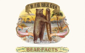
The 'Overstrike' version is the same great image except the embossed "Bear-Facts" title has been covered up with gold leaf and replaced with a different brand name. I might add that all aspects of the replacement title are very poorly done. This wonderful image obviously became a vanity label for some guy named 'Big' Baer. Here is where the aforementioned 'affordable' part comes into play...the overstrike version is about $200 less than the original version (if you can find one).

This Herman Schott image is pretty interesting. I'm not sure if they wanted you to think that their cigar would explode with flavor when you lit it up or explode in your face...Ha! Actually the really interesting fact about this brand is that the outer is a 3rd generation version and a 'Cover-Up'. 
The original label was titled "Radius", the 2nd version was titled "J. Radius" and finally the 3rd version became a 'Cover-Up' by placing a yellow piece of paper over the "J. Radius" title and printing the original title again. I guess it was a heck of a lot cheaper doing it this way than creating a new image and title for your cigar brand. Still, it is a pretty cool label even with the 'Cover-Up'. I have many examples of 'Versions' in my collection and look forward to discovering many more. If you would like to share your 'Versions' with the rest of us...let me know. I am always up for a Part II or you could write an article yourself...Ed (Mr. Bar-B-Q) would really like that. Hope you enjoyed the info...until next time,
|

